Paul's Adventures in Letterpress
At the last count, the number of typefaces occupying my font management library sat at 6,886. Of these, I probably use around 1%.
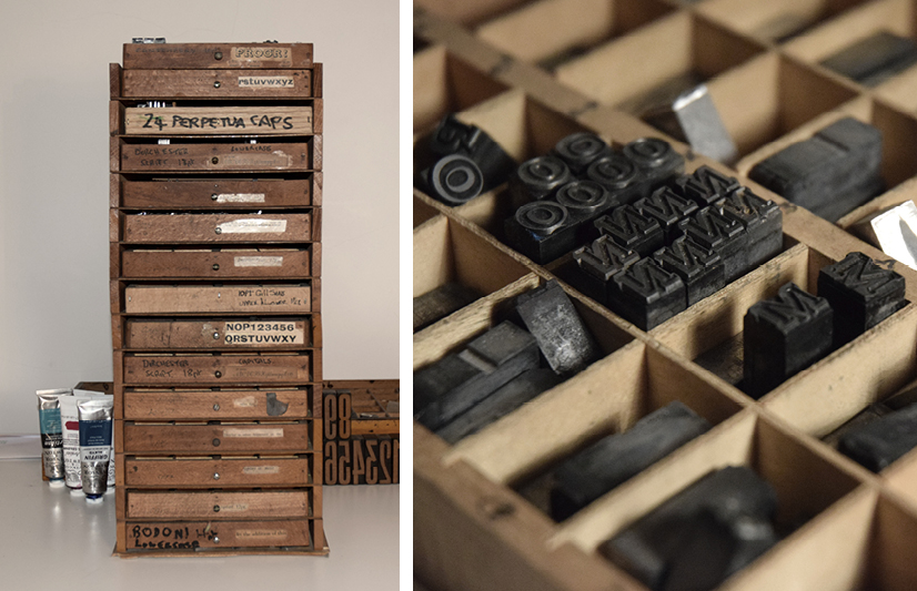
This is one reason I enjoy fiddling around, printing bits and pieces with my Adana 8×5 letterpress machine and letterpress in general. I only have a handful of typefaces which are usable (and organised). Perpetua 36pt, Rockwell Shadow 24pt, Akzidenz 18pt, Imprint 12pt, Gill Sans 10pt are the main ones. This restriction is a welcome break from scouring font libraries.
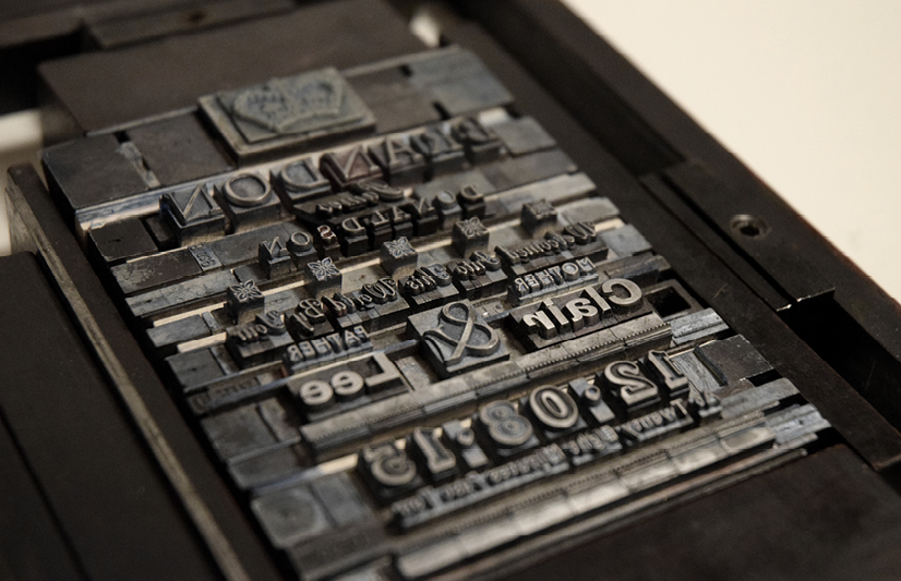
The restrictions don’t stop there either. Unfortunately, I am not blessed with fully stacked type drawers, so if a set of letters doesn’t have enough ‘E’s for what I want to print then tough, I can’t use it. So more often than not, the choice is out of my hands and the design is dictated to me, based on availability rather than preference.