Developing the RBH brand
We were delighted to work with RBH hotel management, formerly Redefine BDL Hotels, on their new company logo design and full rebrand recently. The hotel management group, with offices in London, Leeds and Glasgow, has over 75 hotels in their portfolio. They were one of our first clients when we were starting out as a young graphic design agency.
Their new brand identity is derived from several elements. Their heritage and decades of experience in the hospitality sector, as well as their personality and approachability, were the focus of the new branding.
We wanted to give a nod to their previous branding, keeping it recognisable, aiming to develop a logical evolution for the business, while still elevating and updating the brand.
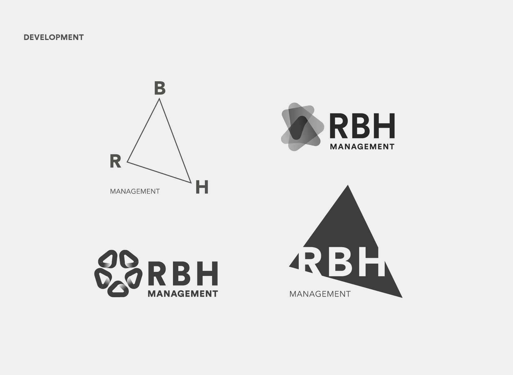
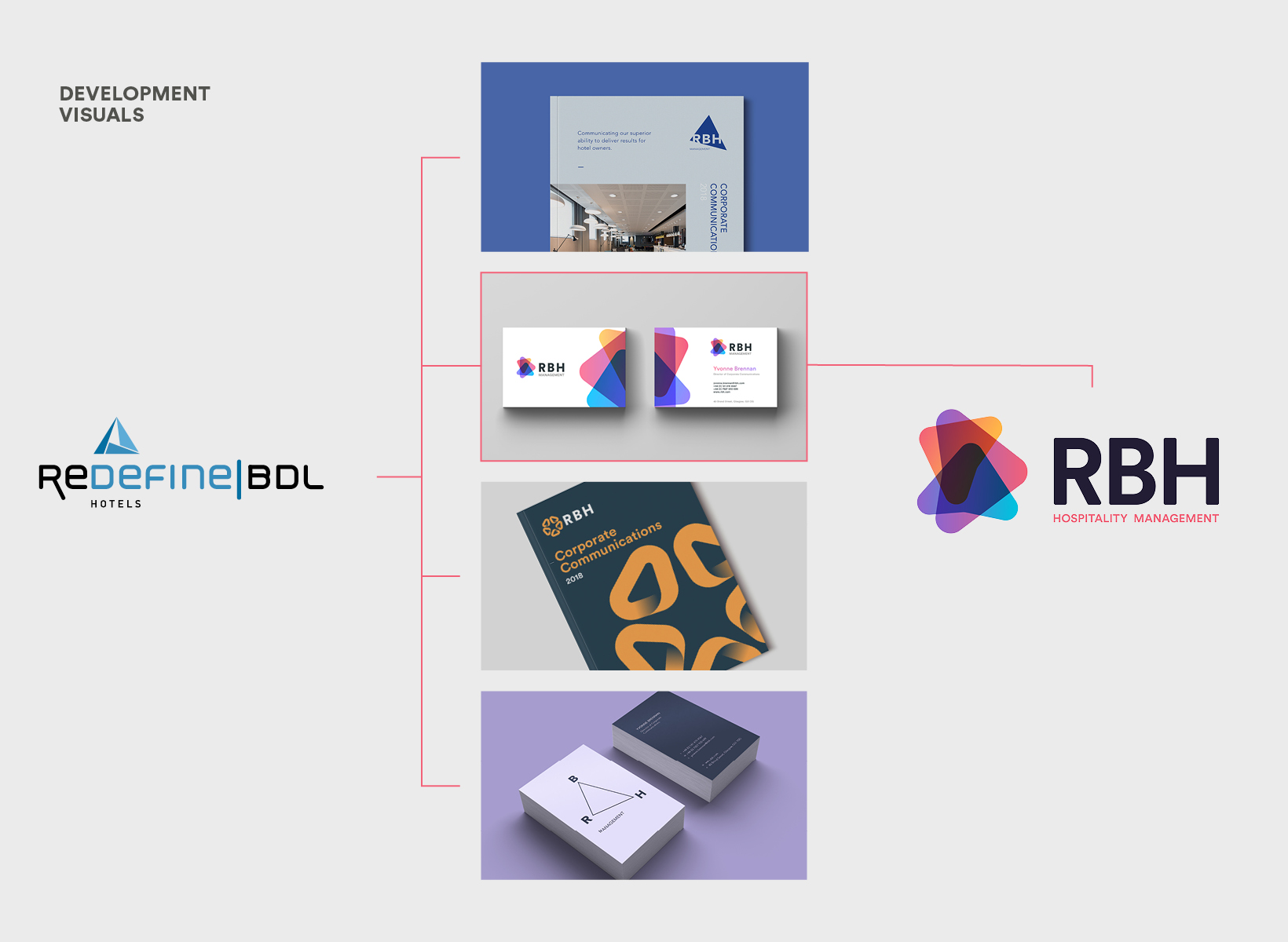
Development
During our development stages, we played with some options that we’ve shared below. We played with electric blue to inject some power; warming, vibrant gradients, the infinity symbol, showing continuity in excellence and forward thinking.
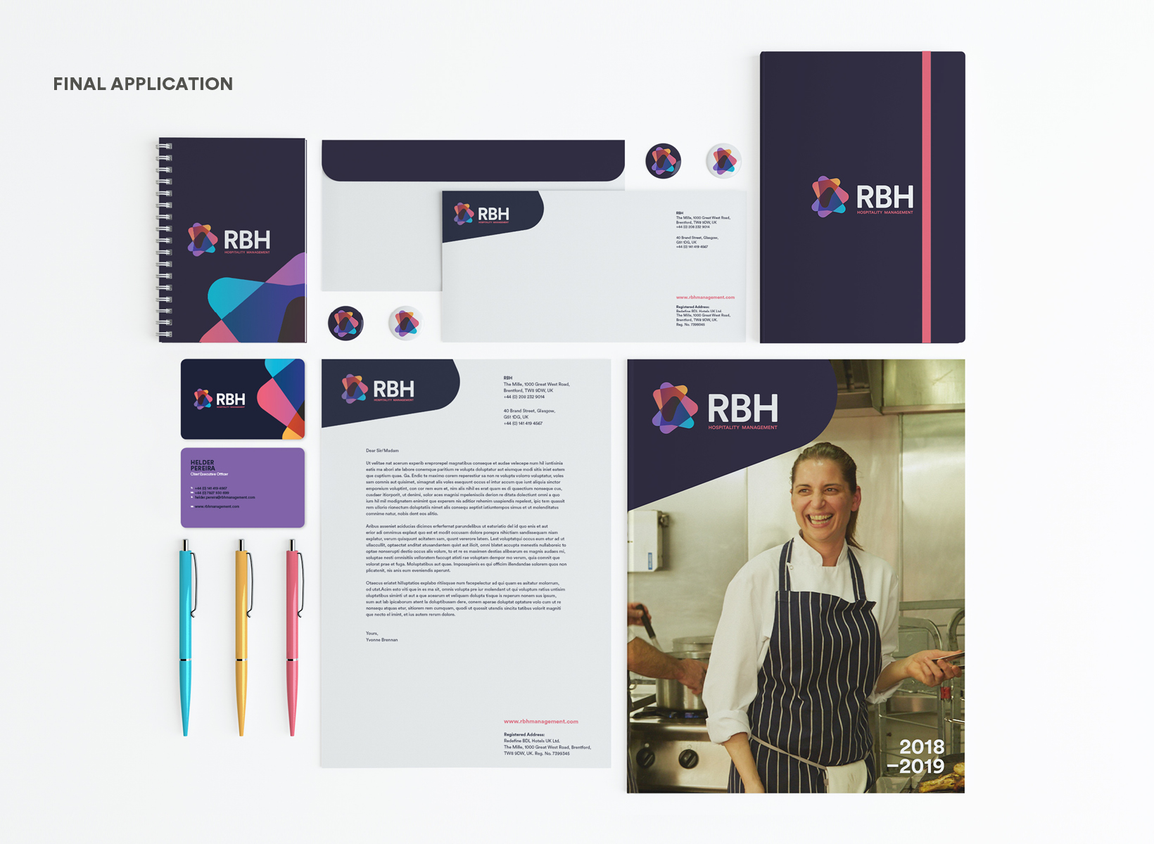
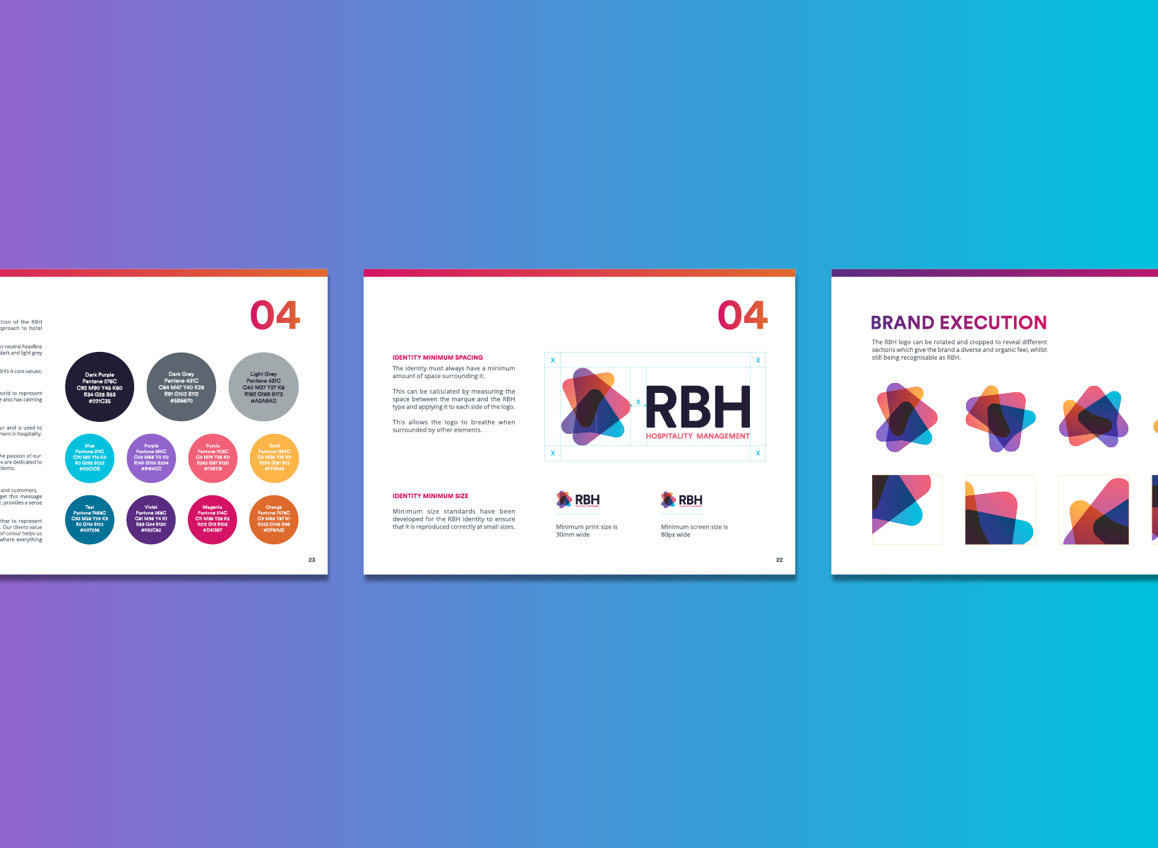
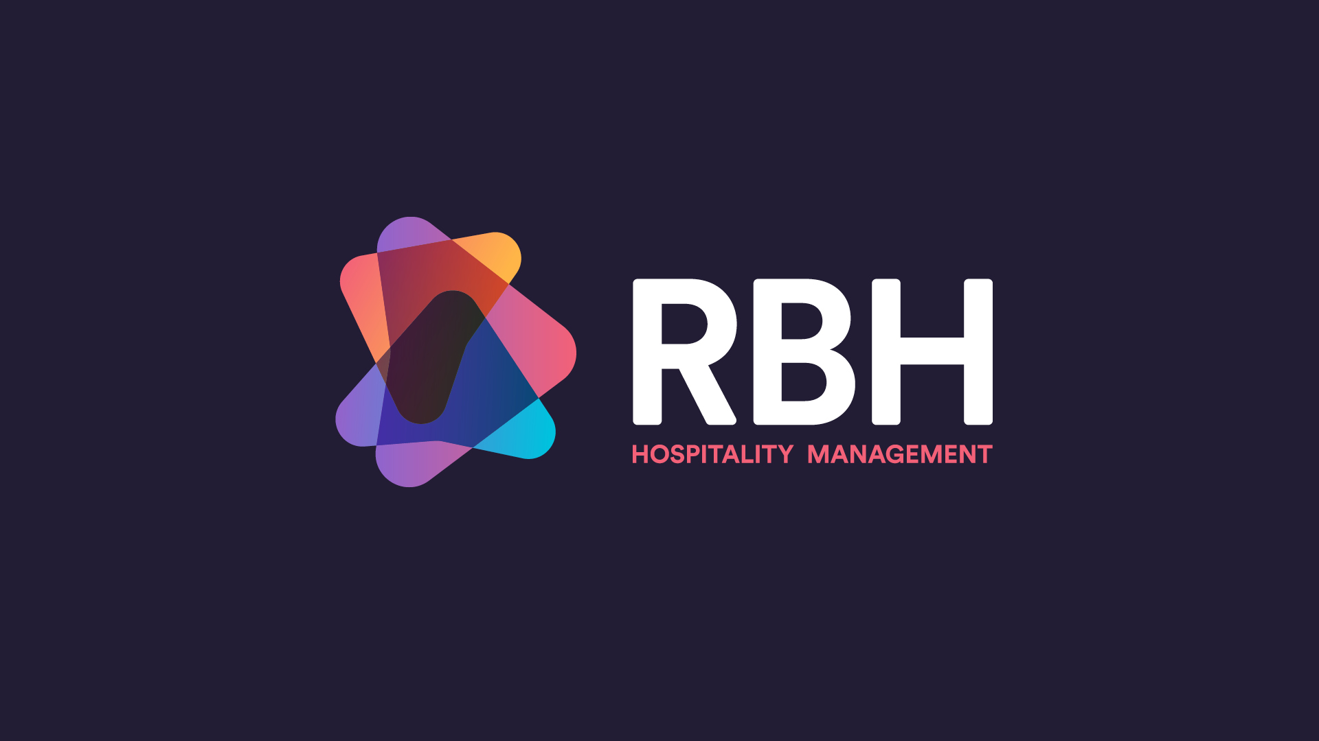
The final solution was a series of transparent overlapping triangles. Shapes overlap each other, representing the strong connection and relationship RBH has with their clients. Nothing is hidden with this identity – it shows the full picture. RBH felt this was the most fitting to take them forward into a new era.